
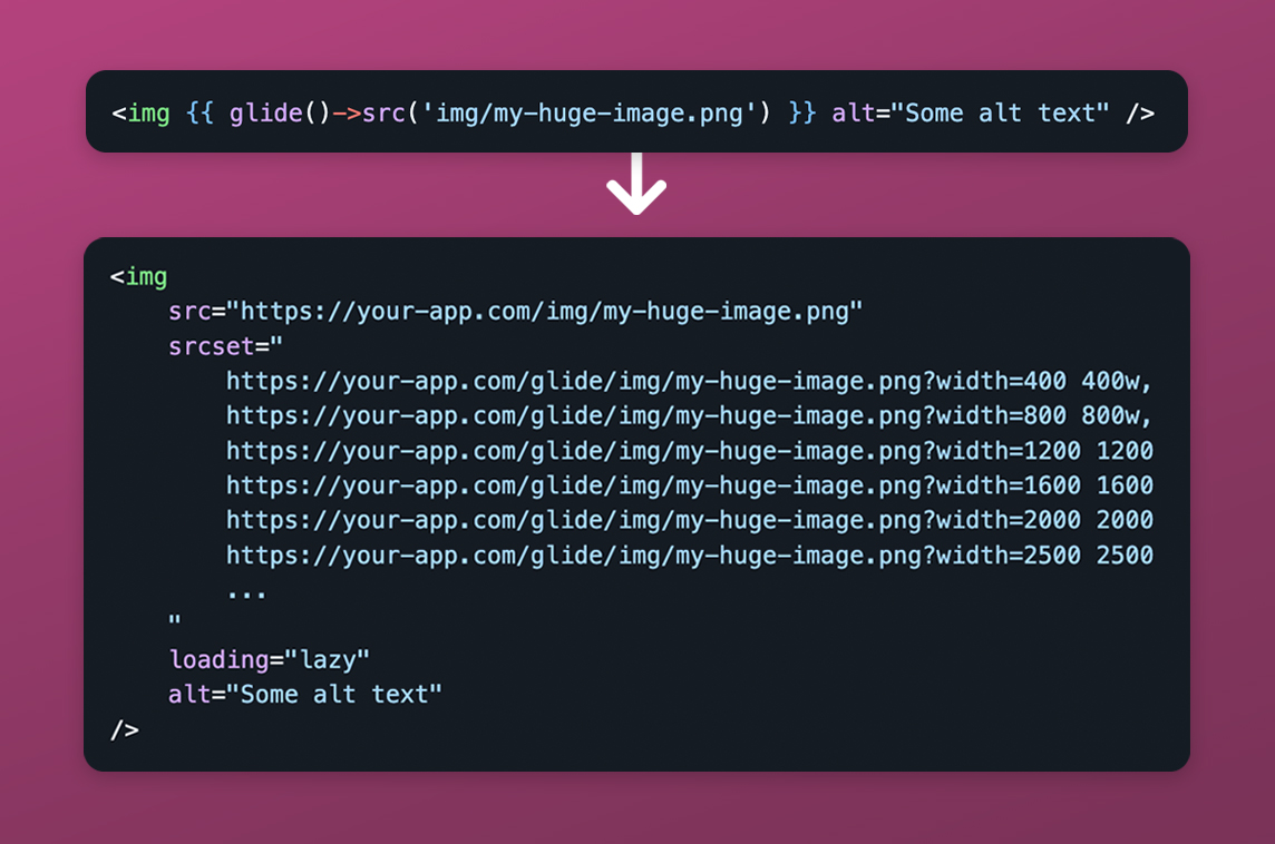

Description
Responsive Image Generation
Overview
In modern web development, serving images that are responsive and appropriately sized is essential. Each image should be scaled to multiple dimensions so that browsers on smaller screens avoid downloading unnecessarily large files. This is typically achieved using the srcset and sizes attributes on <img> tags.
The Challenge
When a client provides a high‑resolution file, such as 3000 × 2000 px, manually creating several resized versions, naming them consistently, and placing them in the correct public directory is tedious. Ideally, you would simply drop the original image into your project, reference it with a src, and let the system handle the rest.
Solution
This package streamlines that workflow by automatically generating responsive image variants and managing their integration, offering a simple and effective solution.
Related Projects

Laravel Artifact
Media Management Package

Mirror
Impersonation Package
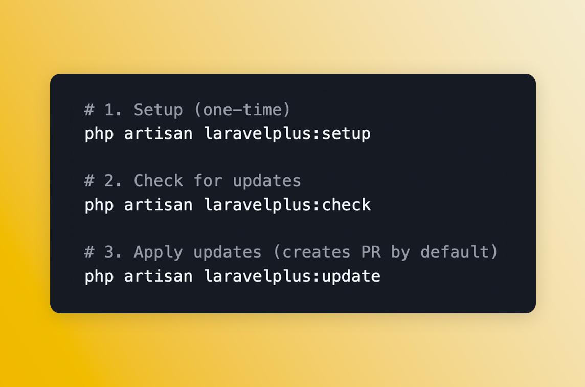
LaravelPlus Updater
Sync Laravel Projects

Laravel Credits
Credit Management System
Laravel Glider
Glide Image Manipulation in Blade Templates
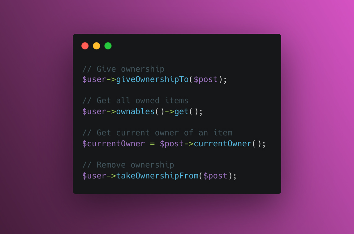
Laravel Ownable
Eloquent Ownership Relationships