
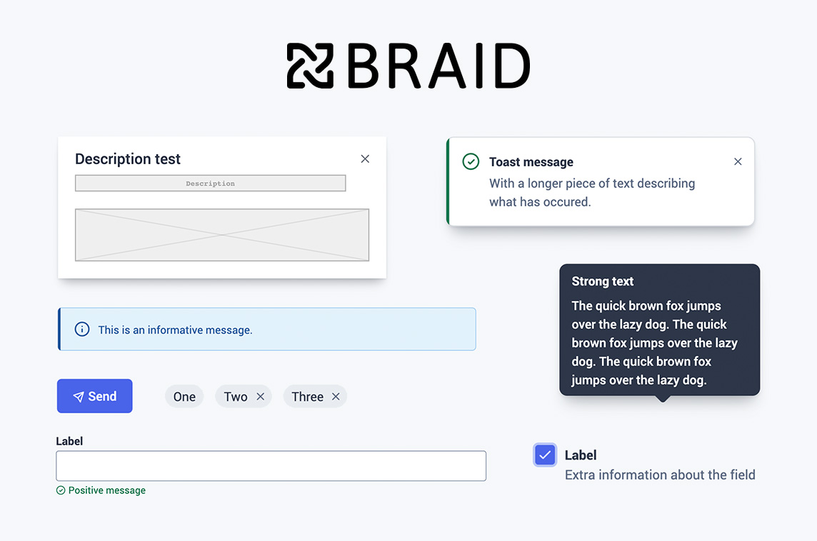

Description
Themeable Design System
Overview
The Braid design system is engineered to accelerate cross‑brand UI development while upholding high standards of quality and accessibility. It consists of a collection of React components and theme definitions.
Developer-Friendly Code
We strive to make the Braid codebase intuitive for non‑developers, prioritizing simplicity and composability in its API.
Collaboration Focus
Our objective is to enable designers and developers to iterate together within the same environment using identical components. This approach minimizes the need for high‑fidelity mockups before development begins, allowing teams to devote more time to refining the product rather than polishing prototypes.
Creator
SEEK Group
Related Projects
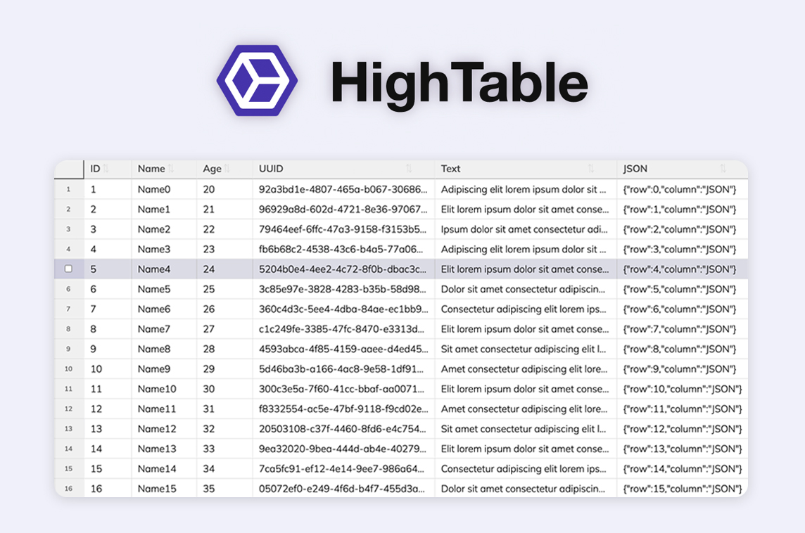
Hightable
Virtualized Table Component
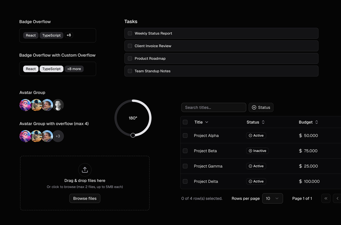
Dice UI
Shadcn/ui Component Library
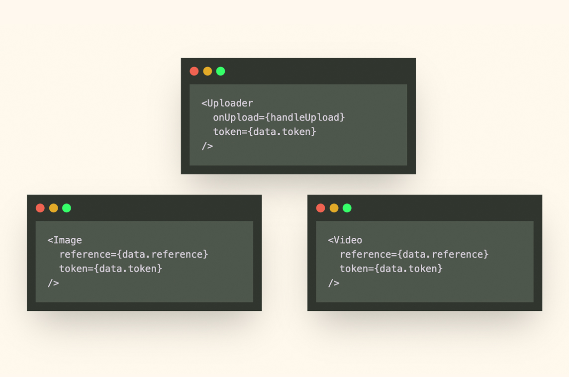
FileKit.dev for React
Drop-in File Upload & Media Streaming Components
Sillybits
Landing Page Building Blocks
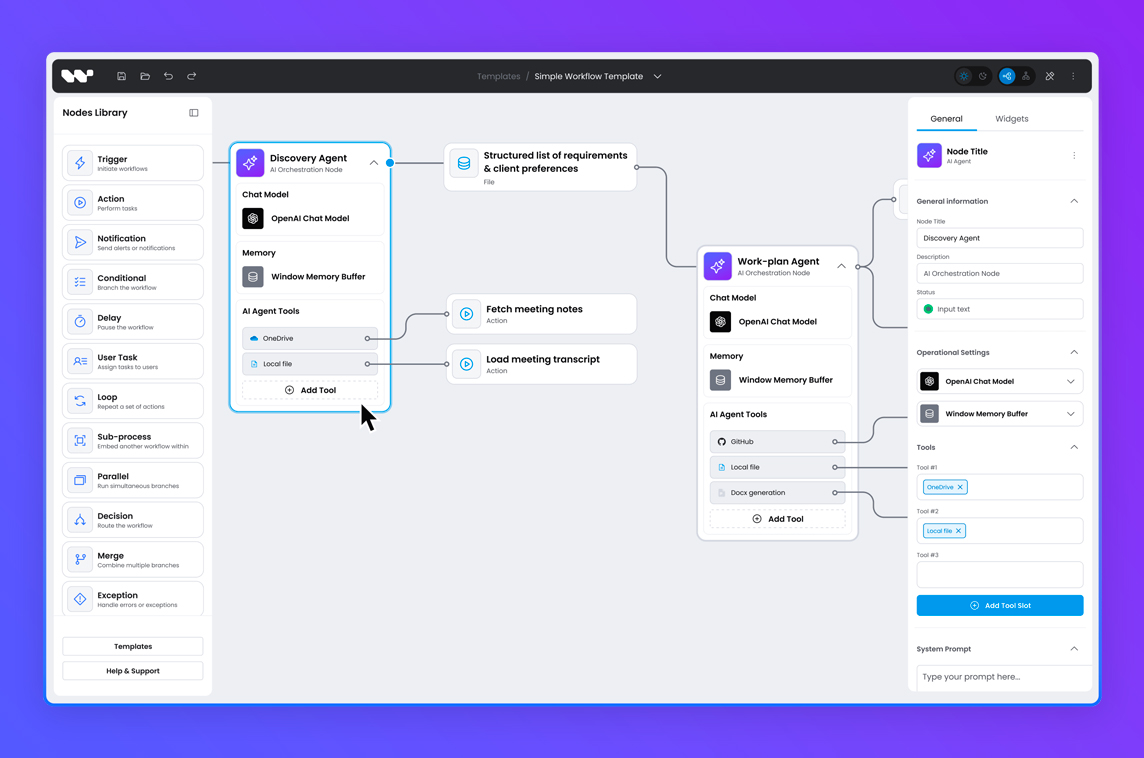
Workflow Builder
Node-based Workflow Editor SDK
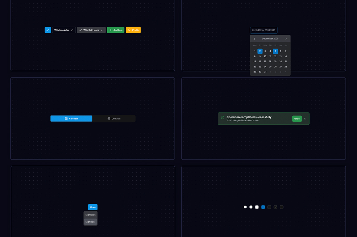
Overflow
Open-source UI Components for React Flow