

Description
Interactive Data Visualization Experiment
Background and Motivation
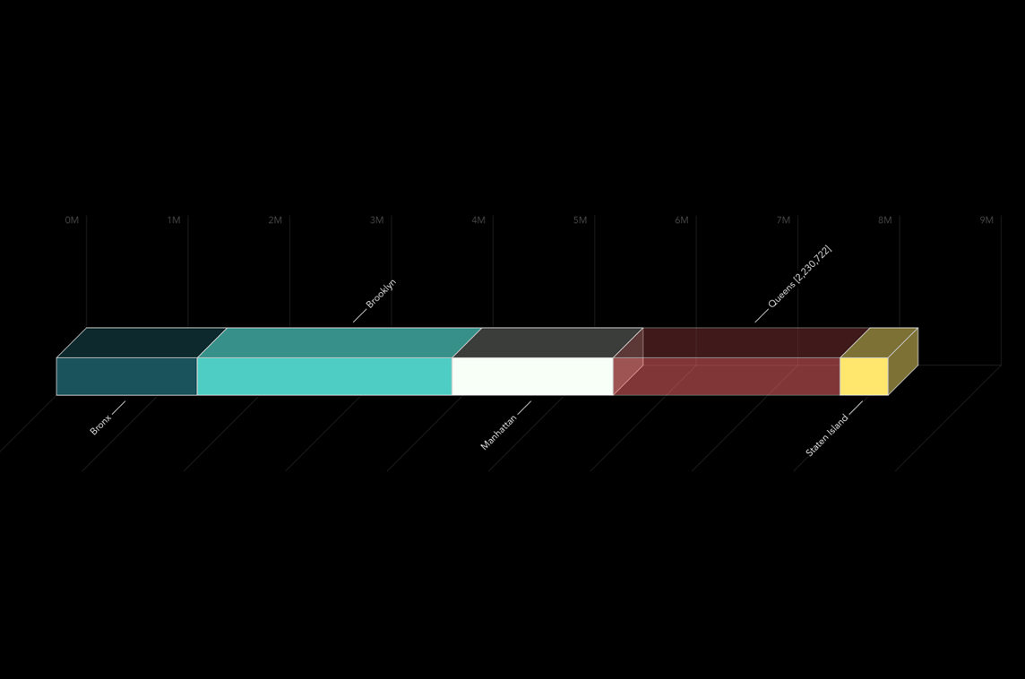
I have long wondered why data visualization tools lack a nested bar chart interface that allows users to explore the components contributing to a specific data point. Additionally, I sought a method to present this exploration in an engaging, interactive format.
Implementation Overview
Using 2010 census data from NYC Open Data on population by borough and neighborhood, I created a visual representation that displays:
- The population of each New York City neighborhood.
- How individual neighborhoods aggregate into the millions of residents across the city’s five boroughs.
Personal Connection
This project holds special significance for me, as Brooklyn—one of the boroughs featured—is my home since 2002.
Creator
cloudred
@cloudred
Related Projects

Placid.app
Creative Automation Toolkit
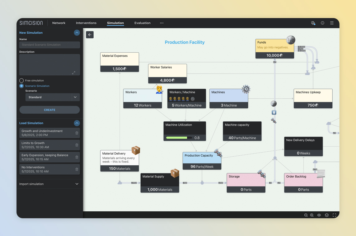
simcision
Tool for Simulation-based Decision Making
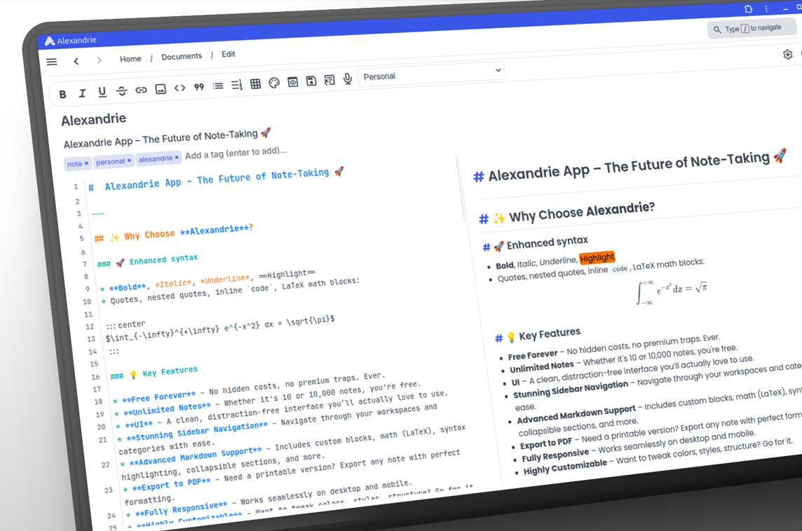
Alexandrie
Open-source Markdown Note-Taking App
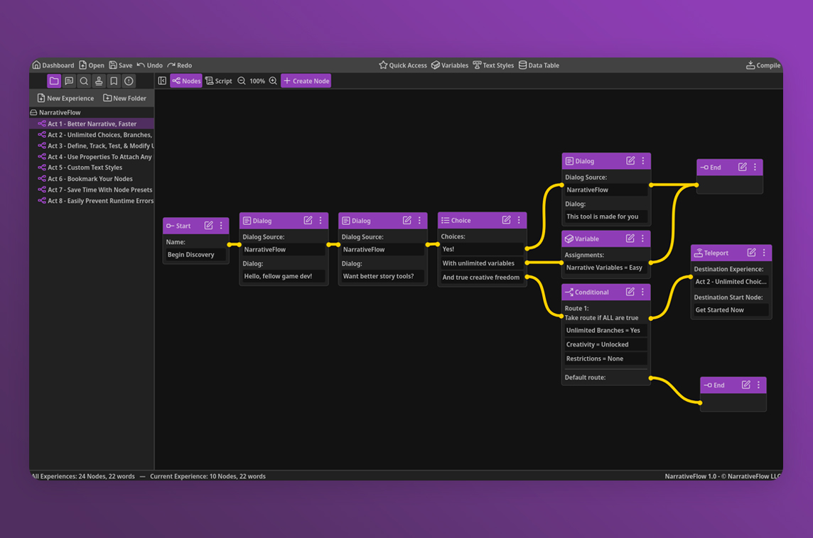
NarrativeFlow
Visual Narrative Design Tool for Game Developers

Deadlines
Minimalist Deadline Tracker
ScreenAsk
Screen Recording Links for Customer Support